


All about Web Accessibility, WCAG and making WordPress website more compliant
Over 96% of the top 1 million websites don’t meet WCAG 2 standards, meaning nearly 16% of your potential customers—those using assistive technologies—are unable to access your site. This not only narrows your audience but also exposes your business to significant financial risk. For instance, initial violations can result in fines up to $75,000, with subsequent breaches carrying penalties of up to $150,000, along with potential compensatory damages, attorney fees, and mandated corrective actions.
While WCAG guidelines aren’t laws in themselves, they are essential for meeting legal requirements such as the ADA in the United States and the upcoming European Accessibility Act in June 2025. Ignoring accessibility standards can damage your brand reputation and lead to serious legal repercussions.
What is WCAG?
WCAG stands for Web Content Accessibility Guidelines. Developed by the World Wide Web Consortium (W3C), these guidelines are the internationally recognized standard for digital accessibility. WCAG provides a set of success criteria that developers and designers can use to remove barriers and make web content accessible to people with disabilities.
There are three levels of conformance: A, AA, and AAA. Each level building upon the previous one. AAA being the highest level of accessibility.
| Level | Description | Examples |
| A | This is the minimum level of accessibility, addressing the most fundamental barriers for users with disabilities. | Providing alternative text for images. |
| Using proper heading structure. | ||
| AA | This intermediate level includes all Level A requirements and adds more comprehensive criteria to accommodate a wider range of disabilities. | Ensuring sufficient color contrast between text and background. |
| Providing captions for live audio and video. | ||
| Making all functionality available via a keyboard. | ||
| AAA | This is the highest level of accessibility, indicating a very high standard of inclusivity. It includes all Level A and Level AA requirements, as well as more demanding criteria. | Providing sign language interpretation for video content. |
| Providing text transcripts for audio content. | ||
| Ensuring a higher color contrast ratio. |
Understanding the four principles of WCAG
The Web Content Accessibility Guidelines (WCAG) standards are structured around four key principles: Perceivable, Operable, Understandable, and Robust (POUR).
1. Perceivable
Present your content so that every user can access it. For example, add text alternatives for images to ensure that those who can’t see them still grasp their meaning.
How to make your website more perceptive?
- Use alt text for images: Describe images with short, clear text so screen readers can read them aloud.
| Good alt text for screen readers | Bad alt text for screen readers |
| A photo of a woman smiling and holding a baby. | Image of a woman and a baby. |
| A screenshot of the Google homepage. | Screenshot. |
- Add captions and transcripts: Videos should have captions, and audio files should include transcripts so users who can’t hear can still access the content.
- Ensure good color contrast: Text should stand out clearly against its background to make reading easier. Ensure the visual presentation of text and images of text has a contrast ratio of at least 4.5:1.
2. Operable
Users must be able to navigate and interact with your website using different input methods. This means that users should be able to interact with all website elements, regardless of their abilities. For instance, ensuring keyboard accessibility allows users who cannot use a mouse to navigate the website.
How to make your website more operable?
- Make all functionality keyboard accessible: Users should be able to navigate your site without a mouse.
- Avoid flashing or auto-playing elements: These can cause seizures or overwhelm users.
- Provide clear and consistent navigation: Menus, links, and buttons should be easy to find and use.
- Ensure interactive elements are easy to use: Forms, buttons, and links should have proper focus states and be accessible with assistive technologies.
3. Understandable
Your website should be easy to comprehend and use, with clear instructions and predictable behavior.
How to make your site more understandable?
- Use simple, readable language: Use simple language and clear, concise wording.
- Provide helpful error messages: Forms should include clear instructions and error messages.
- Maintain a consistent layout: Navigation and design elements should stay predictable across pages.
- Label form fields properly: Ensure forms have clear labels and instructions to help users complete them correctly.
4. Robust
Your website should be compatible with different browsers, devices, and assistive technologies. This ensures that users can access the content even as technologies evolve.
How to make your site more robust?
- Use ARIA roles and attributes correctly: Enhance accessibility for users relying on assistive technology.
- Write clean, semantic HTML: Proper HTML structure helps all users access content efficiently.
- Ensure compatibility with assistive technologies: Test your website with screen readers and other tools. Popular screen readers include NVDA, JAWS, and VoiceOver (for Mac). Other assistive technology tools that can be helpful for testing include browser extensions and online accessibility checkers.
- Validate your code: Use W3C validation tools to catch and fix accessibility errors.
Common accessibility issues on websites
Here are some common accessibility issues that can hinder users from accessing your content.
Visual impairments
- Inadequate or missing alt text: Screen readers rely on atl-text to describe the content of an image to visually impaired users. It is also important to avoid using generic text as it defeats the purpose and may not convey the actual meaning of the image.
- Insufficient colour contrast: Low colour contrast between text and the background could create difficulties in reading for users with visual impairments.
- Lack of resizable text: Users with low vision should be able to zoom in without disrupting the page layout, ensuring the content remains clear and easy to read.
Keyboard navigation and motor impairments
- Poor keyboard navigation: Ensure your website is fully navigable with just a keyboard. Inaccessible forms or buttons can lead to a frustrating experience for users who rely on keyboard-only navigation.
- Missing skip navigation links: Skip links help keyboard and screen reader users navigate efficiently by allowing them to skip repetitive navigation sections and jump directly to the main content.
Cognitive disabilities
- Lack of proper headings: The use of headings to organize content makes it easier for screen readers to interpret the structure of the page. If headings are missing or improperly nested, it can be challenging for users with cognitive disabilities to navigate the page.
- Non-descriptive link text: Screen reader users and those with cognitive disabilities may find it difficult to understand links with generic anchor text such as “click here” or “read more”. Instead, links should include descriptive text that clearly states their purpose.
- Dynamic content not announced: Screen readers should announce changes in content, like modal pop-ups or dynamic form validation messages, to ensure that users with cognitive disabilities are aware of them.
Auditory impairments
- Video and audio without captions or transcripts: Multimedia content should include captions and transcripts to be accessible to users who are deaf or hard of hearing.
All users
- Inaccessible forms: Forms should have clear labels, instructions, and error messages.
- Missing or inconsistent ARIA attributes: Proper ARIA (Accessible Rich Internet Applications) attributes are essential for accessible web experiences; errors in their use can confuse assistive technologies.
CAPTCHA issues
CAPTCHAs are designed to prevent spam, but they often pose accessibility challenges. Some problematic CAPTCHA types include:
- Distorted text: These CAPTCHAs display distorted letters that are difficult for users with visual impairments to decipher.
- Audio CAPTCHAs: These require users to listen to garbled voices, which can be challenging for users with auditory impairments or those using screen readers.
- Image CAPTCHAs: These often require users to identify images that meet specific criteria, posing problems for users with visual impairments.
Consider using accessible CAPTCHA alternatives, such as reCAPTCHA v3, which uses an invisible scoring system to identify bots without requiring user interaction
Best practices for creating accessible WordPress websites
Building an accessible website requires careful consideration made from the early stages of design and development.
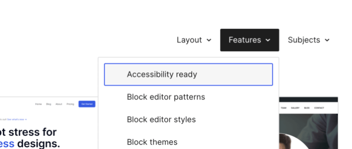
- Choose an accessible theme: The WordPress themes repository allows you to filter themes that are accessible and have been known to adhere to the WCAG standards. Use ‘accessibility-ready’ feature to filter out the themes that are accessible.
- Use semantic HTML: Use of semantic tags in your HTML content gives a logical structure that makes it easier for users of assistive technologies to understand the page hierarchy.
- Regions: A webpage typically consists of several content blocks—such as the header (logo, navigation links, etc.), the main content area, a footer, and sometimes a sidebar.
- Use of semantic HTML tags define this structure like,
<header>,<nav>,<main>,<aside>and<footer>. This helps screen reader users to navigate between these major content blocks.
- Use of semantic HTML tags define this structure like,
- Headings: Headings serve as the outline for your content, with the H1 tag representing the page title and ideally appearing only once. Use headings in a logical order without skipping levels, so screen readers can easily navigate from one section to the next.
- Lists: Ensure proper list markup is used whenever your content includes a logical list. For example, use ordered lists (
<ol>) to present sequences or rankings clearly.
- Add meaningful alt text to all images: Ensure that all images, including featured images and those within the content, have descriptive alt text that conveys their meaning. This is essential for screen readers to accurately describe images to visually impaired users.
- Ensure keyboard navigation: Ensure your website is fully navigable via keyboard. Regularly test and fix any navigation errors.
- Focus states: To help users navigate with a keyboard it is important that the element in focus is clearly visible and distinguishable from the rest of the elements.
- Focus order: The keyboard navigation should move from one element to the next in the logical order that is consistent with the meaning of the content.
- Skip link: Introduce skip navigation link to jump directly to main content and avoid tabbing through the navigation links.
<a class="skip-link screen-reader-text" href="#content"> Skip to content </a>
- Use ARIA landmarks: Screen readers can use ARIA attributes to add context and help users understand your page’s structure and purpose. ARIA is especially useful when semantic HTML falls short—take a custom dropdown menu, for example. With ARIA, its function is clear to assistive technologies, even if its appearance is crafted with CSS and HTML alone.
			<div class="custom-dropdown">
  <div class="selected-option">Select an option</div>
    <div id="dropdown-options" class="dropdown-options" hidden>
      <div id="option1" class="option">Option 1</div>
      <div id="option2" class="option">Option 2</div>
      <div id="option3" class="option">Option 3</div>
  </div>
</div>
But, with appropriate ARIA tags, it adds the structure and context that assistive technologies can use. Following example add some important ARIA attributes,
- role=”combobox” tells assistive technology this is a dropdown selection control
- aria-expanded communicates whether the dropdown is currently open
- aria-haspopup=”listbox” indicates that activating this control will display a listbox
- aria-controls associates the control with the popup it manages
- role=”listbox” and role=”option” define the structure of choices
- aria-selected indicates which option is currently selected
			<div class="custom-dropdown" role="combobox" aria-expanded="false" aria-haspopup="listbox" aria-controls="dropdown-options">
  <div class="selected-option" tabindex="0">Select an option</div>
    <div id="dropdown-options" role="listbox" class="dropdown-options" hidden>
      <div role="option" id="option1" class="option" tabindex="-1" aria-selected="false">Option 1</div>
      <div role="option" id="option2" class="option" tabindex="-1" aria-selected="false">Option 2</div>
      <div role="option" id="option3" class="option" tabindex="-1" aria-selected="false">Option 3</div>
  </div>
</div>
- Ensure sufficient color contrast: As per WCAG guidelines, the recommended contrast ratio between the text color and background color for small text is 4.5:1 and for large text 3:1. Use contrast checkers to ensure your website has sufficient contrast.
- Create accessible forms: Provide clear labels, descriptions, and instructions for all form fields. Display concise error messages and ensure that users can complete the form entirely using keyboard navigation.
- Conduct regular accessibility audits: Use automated tools and manual testing to regularly check your website for accessibility issues and ensure it remains compliant with WCAG standards.
How to implement accessibility in your development workflow
To build accessible websites effectively, incorporate accessibility considerations from the start of your development process.
Start with accessibility in mind
Plan for accessibility at the design and development stages, rather than treating it as an afterthought.
We discussed some helpful figma plugins in our previous blog on best practices for web accessibility.
Use testing tools
Leverage accessibility tools like WAVE and Lighthouse to identify and fix common accessibility issues early in the development journey. Developers can test their changes frequently to ensure the code they write complies with the WCAG standards.
Read more for further information.
Peer reviews and manual testing
Include accessibility checks in every code review to catch issues that automated tools might miss. Use a pull request checklist for engineers to verify key accessibility elements. While automated tests can flag missing alt text or broken links, peer reviews ensure that the provided alt text is both meaningful and contextually appropriate.
			## Pull Request Accessibility Checklist

- [ ] Images have appropriate alt text
- [ ] Color contrast meets WCAG AA standards
- [ ] Keyboard navigation works properly
- [ ] Form elements have proper labels
- [ ] ARIA attributes are used correctly
- [ ] Tested with screen reader
Integrate accessibility into CI/CD pipelines
Automated workflows should check for coding standards and accessibility compliance before merging code changes. This would ensure that any accessibility violation can be caught before the code reaches the production website.
Learn more about integrating Pa11y-CI to test deployments on non-production environments and act on any reported accessibility violation.
Continuous improvement
Focus on ongoing accessibility improvements instead of trying to fix everything at once. Track your progress and tackle the most critical issues first for lasting impact.
Regular audits
Website accessibility isn’t a one-and-done task. As assistive technologies and WCAG standards evolve, your site must be continuously updated to remain inclusive. Regular accessibility audits—combining automated testing with manual reviews by experts—are essential to keep your website user-friendly over time.
Conclusion
WCAG compliance is just the starting point—true accessibility goes far beyond ticking boxes. It’s about cultivating a culture of inclusivity and empathy in your development practices. Embrace accessibility as a chance to enhance the user experience for everyone, making your website more intuitive, efficient, and impactful.
On this page


Leave a Reply