


Drupal to WordPress Frontend Migration
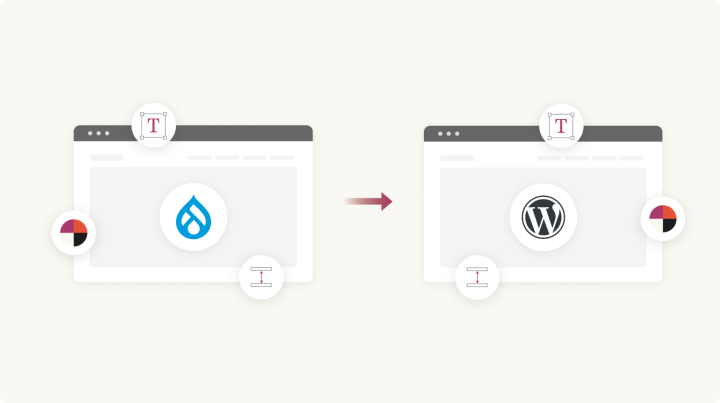
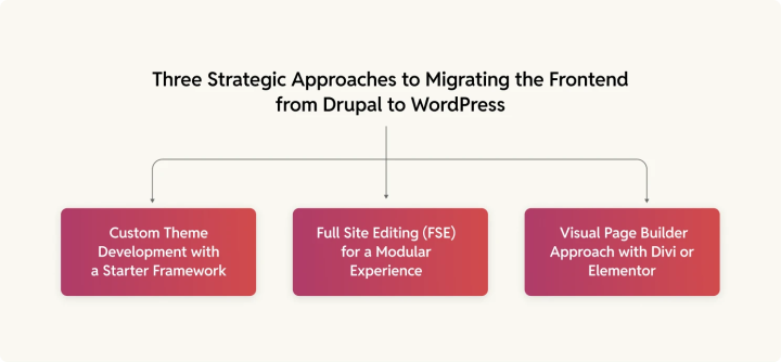
At its core, migrating the frontend of a Drupal stack to WordPress involves building a custom WordPress theme that matches or improves upon the Drupal frontend. Depending on your organization’s needs, this theme can be:
- A fully custom-built theme using a starter framework.
- A block-based Full Site Editing (FSE) theme for a more modular and future-proof experience.
- A theme leveraging page builders like Divi or Elementor
Before we see how you can build this, let’s see how Drupal page components map to WordPress.
Step #1: Initiate theme development with a starter theme
The first step in migrating your frontend is choosing an approach for WordPress theming. Typically, you’ll start developing your WordPress frontend with a starter theme.
For example, at rtCamp, we start with the _s (underscores) starter WordPress theme. Such starter themes provide a clean slate, with minimal styling or layout, allowing for flexibility in customizations. The design isn’t added to the starter theme right away but is instead developed and integrated as the theme structure is built out. Even when we start this theme, we design keeping modularity in mind, as in the theme we develop is still a block-by-block approach.
That said, you can start with a block-based minimal theme too, for a head start. These themes use Gutenberg blocks for layout control instead of traditional PHP templates, and so they’re kind of future-proof with native WordPress support for site-wide customization. For some use cases, these might be the better choice.
Alternatively, if you’ve already decided upon using a theme like Divi or a page builder, you can go with those.
Step #2: Set up your core theme structure
Once you’ve selected the theme development approach, it’s time to set up the core theme structure:
By focusing on setting up the core theme structure first, you’re essentially building the skeleton of your website. This step serves as the foundational framework that will support all future design and functional enhancements.
It’s crucial to establish a solid structure before diving into the design integration, as it ensures the site will function smoothly and remain flexible as you fine-tune the aesthetic elements later on.
Here are a few key themes to keep in mind.
Modular layout
A key principle of WordPress theme development is modularity. This means creating reusable, easily maintainable components that can be integrated across the website.
For instance, you’ll create separate template parts for elements like the header (header.php), footer (footer.php), and various components within the body, such as navigation menus, sidebar widgets, and custom sections. These template parts are stored in the template-parts/ directory, allowing them to be used across multiple pages, reducing redundancy and improving maintainability.
The modular approach mirrors Drupal’s region-based layouts, which divide the page into distinct, reusable sections. It allows your theme to be more flexible and scalable as you continue developing and integrating additional features. By breaking the layout into these components, you can easily replace or adjust specific sections later on without affecting the entire structure.
Responsive design
With the core layout in place, it’s essential to ensure the website is mobile-first and fully responsive. WordPress themes should automatically adjust to different screen sizes, from desktops to tablets to smartphones. Utilizing CSS media queries ensures that your theme remains fluid and adapts to varying viewport widths.
Responsive design not only provides a better user experience across devices but also plays a role in SEO. Search engines like Google prioritize mobile-friendly sites, so ensuring your theme is responsive can have a positive impact on your search rankings.
During this phase, you will:
- Create flexible grid layouts using CSS.
- Define media queries to adjust the design based on the screen size.
- Ensure that elements like navigation menus, images, and text flow properly across devices.
Separation of functionality and design
Before design integration takes place, the core theme should separate functionality from styling. This means placing all the PHP logic, custom post types, and integrations within the theme structure while keeping the design elements within the CSS and JavaScript files. This separation allows for easier customization and more efficient updates, as you won’t need to tweak the core functionality every time you change the design.
For example, create custom page templates for specific layouts (like homepage, contact page, or service page) and define them in your theme’s root directory. These templates will provide a skeleton for the content of those pages. The next steps, like styling and adding interactive elements, will build on top of this structure, ensuring a smooth transition into design integration.
Global styling
During this phase, establish global styles for typography, colors, spacing, and UI elements. Apply CSS variables for easy customization and consistency across the site. These variables will define things like:
- Colors: Primary, secondary, and accent colors for branding.
- Typography: Font families, sizes, and line heights.
- Spacing: Margins and padding for consistent layout.
Ensure these styles are applied across all elements of the theme to create a cohesive visual identity from the start.
Step #3: Mapping Drupal components to WordPress and recreating the design blocks
An essential part of your migration is understanding how Drupal’s design capabilities map to WordPress equivalents. This mapping varies depending on whether you’re using a block-based theme. In general:
- Migrating to a block-based theme? Full Site Editing and Gutenberg provide direct equivalents for Drupal’s components, making for a smoother transition.
- Migrating to a traditional theme? Expect a more hands-on process, involving PHP templates, widgets, and possibly a page builder to replicate Drupal’s flexibility.
Understanding these differences upfront will help streamline the migration process and ensure a structured, functional WordPress site post-migration. Let’s zoom in.
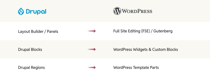
Drupal Layout Builder & Panels → WordPress FSE & Gutenberg
Drupal’s Layout Builder and Panels allow users to create flexible page structures with drag-and-drop functionality. WordPress provides two different approaches to achieve the same result, depending on the type of theme:
- For block-based themes: Full Site Editing (FSE) and Gutenberg blocks offer a seamless transition, enabling users to replicate Drupal layouts using Block Templates and Template Parts. Custom dynamic content can be managed using native Gutenberg blocks or third-party block plugins like ACF Blocks.
- For traditional themes: The migration requires PHP templates and widgetized areas. While some flexibility can be achieved with get_template_part(), for true drag-and-drop capabilities, a page builder or repurposing the Gutenberg editor will be required.
Drupal Blocks → WordPress widgets and custom blocks
Drupal’s block system, which allows for placing content within defined regions, translates differently based on the WordPress theme structure:
- For block-based themes: Drupal blocks can be mapped directly to Gutenberg blocks. Custom blocks can be created with Advanced Custom Fields (ACF) or native WordPress block development.
- For traditional themes: The closest equivalent is WordPress widgets, which can be placed in designated widget areas. If Drupal blocks contain complex functionality, they may need to be rebuilt using shortcodes or PHP-based custom elements.
Drupal Regions → WordPress template parts
Drupal uses predefined regions—such as header, sidebar, and footer—to structure its layouts. In WordPress, the equivalent approach depends on the theme type:
- For block-based themes: Template parts like header.html and footer.html are managed within Full Site Editing and can be edited via the Site Editor.
- For traditional themes: These elements are defined in PHP templates (header.php, footer.php) and included using get_template_part(). Additional layout areas can be created through custom widget areas registered in functions.php.
You get the drift.
Step #4: Design integration
Once the core theme structure is in place, the next phase is to integrate the visual design and ensure the site reflects your brand. This step—design integration—bridges the gap between the bare-bones structure and your new WordPress site’s final look and feel.
By focusing on setting up the core structure first, you’ve created a solid foundation—now it’s time to apply your design vision across the site. Here’s how to approach it for both traditional and block-based themes:
Global styling integration
Ensure that all global styles (colors, typography, and spacing) are fully integrated into the theme’s components.
- Traditional themes: Global styles are typically defined in style.css, via theme customizer settings, or through a preprocessor like SASS.
- Block-based themes: Global styles are managed primarily through theme.json, which allows you to define color palettes, typography, spacing, and other design settings directly within the WordPress editor.
Styling template parts and reusable components
Now, take the modular components from the previous step (like the header, footer, and sidebars) and apply the necessary design elements:
- Traditional themes: Use header.php, footer.php, and widget areas for structural elements. Design is applied using CSS, inline styles, or the Customizer.
- Block-based themes: Header, footer, and other reusable parts are defined as block template parts (header.html, footer.html) and styled within theme.json or using block editor controls. The WordPress Site Editor allows direct customization of these elements without modifying code.
Menus and navigation
Customize the WordPress menu system to match your design, including typography, hover states, and active link styles.
- Traditional themes: Use wp_nav_menu() to register menus, styling them with CSS. Support for mega menus or dropdowns may require custom walkers or plugins.
- Block-based themes: Navigation is handled using the Navigation block, allowing drag-and-drop menu creation directly in the Site Editor. Styles and structure are managed via theme.json and block styles.
Custom widgets and sidebars
If your previous site had a complex system of widgets or sidebars, replicate that functionality while ensuring design consistency.
- Traditional themes: WordPress widgets and custom sidebars are used to manage dynamic content areas.
- Block-based themes: Instead of widgets, use block-based template parts or patterns, allowing for a more flexible and WYSIWYG-like experience.
Styling default blocks
Leverage the Gutenberg block editor to create custom blocks and block patterns, ensuring consistency across your site:
- Traditional themes: Blocks can be styled using CSS or add_theme_support() to define editor styles.
- Block-based themes: Styling is managed in theme.json, allowing for global and per-block customizations directly in the editor.
Step #5: Assembling your pages using reusable components (For both theme approaches)
It’s time to bring everything together to build complete pages.
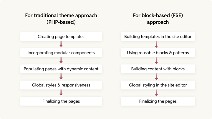
For traditional theme approach (PHP-based):
- Creating page templates:
- In a traditional theme setup, you’ll create PHP templates to define how specific pages are structured. For example, you might have:
- page-home.php for your homepage
- single.php for individual blog posts
- page-contact.php for the contact page
- Each template will pull in various components (header, footer, sidebars) from the modular setup you’ve already created. These PHP files will be the backbone of the page structure.
- In a traditional theme setup, you’ll create PHP templates to define how specific pages are structured. For example, you might have:
- Incorporating modular components:
- Your reusable components (like headers, footers, sidebars, and custom sections) will be included within the appropriate templates. For instance:
- The header will be called in the header.php file.
- The footer will be called in the footer.php file.
- Specific sections (like CTAs or testimonials) will be inserted directly into the template or referenced as partials.
- Your reusable components (like headers, footers, sidebars, and custom sections) will be included within the appropriate templates. For instance:
- Populating pages with dynamic content:
- You will use WordPress functions like the_content(), the_title(), and get_template_part() to populate your pages with content dynamically.
- For blog or portfolio pages, utilize WordPress loops like have_posts() to query and display dynamic content.
- Global styles & responsiveness:
- Apply global styles through CSS or SCSS files, ensuring a mobile-first design that looks consistent across devices. You can use CSS Grid or Flexbox for layout, adapting it for various screen sizes using media queries.
- This stage is where you’ll ensure that the design adapts properly across multiple screen sizes (desktop, tablet, mobile).
- Finalizing the pages:
- Once templates and components are in place, go into the WordPress admin and assign your page templates to the specific pages. Adjust dynamic content where needed (like blog posts, custom post types, etc.) to ensure everything displays correctly.
For block-based (FSE) approach:
- Building templates in the site editor:
- In an FSE setup, you’ll use the Site Editor (or Full Site Editing) to build templates directly using blocks. This is a more visual and modular approach than a traditional theme, and it integrates with the WordPress block editor seamlessly.
- Create templates directly in the Site Editor, such as a Homepage template, a Single Post template, or even a 404 page template.
- These templates use block patterns and reusable blocks to define the layout and structure. You can add header, footer, and other reusable blocks to these templates.
- Using reusable blocks & patterns:
- Create Reusable Blocks for common elements like navigation menus, featured content sections, or testimonials. These can then be inserted into any page or template without redoing the layout each time.
- You can create block patterns for entire sections of content (like hero banners, testimonial grids, or pricing tables), which will then be reusable across your site.
- By making use of reusable components like these, your theme is more flexible and can be updated quickly across all pages with just a small change.
- Building content with blocks:
- Assemble content by adding various Gutenberg blocks in the Site Editor. For example, use Cover Block for banners, Columns Block for multi-column layouts, and Group Block to structure sections.
- For dynamic content, use Query Loop Block to pull in blog posts, products, or other content types, and customize it based on your design (i.e., showing excerpts, images, and meta information).
- Global styling in the site editor:
- Adjust global styling directly in the Site Editor. Use the Global Styles panel to customize typography, colors, and spacing site-wide. This ensures consistency across pages and elements.
- You can also use theme.json to set default styles and custom properties for colors, typography, and layout, which helps streamline customization and maintenance.
- Finalizing the pages:
- Once you’ve created the templates and added the content, preview the pages and check that everything is working as intended.
- Since FSE themes allow for visual building, you can quickly make adjustments to individual elements and layouts through the Site Editor interface, without having to touch code directly.
- Publish your templates and assign them to the specific pages in WordPress. Your dynamic content should now automatically populate based on the templates you’ve defined.
Wrapping it up…
Migrating a Drupal site frontend to WordPress involves careful planning and a clear approach to theme development. Whether you opt for a custom-built, block-based, or page builder-driven theme, the key is to ensure a seamless transition by mapping Drupal components to their WordPress counterparts.


