


How OnePress implements a shared design system across your entire WordPress network
At OnePress, we treat design systems not as documentation, but as living infrastructure. They’re code-backed systems that actually run across your sites.
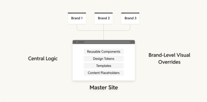
And how do we do it? We work with a robust Master Site model: a centrally managed WordPress environment that houses all shared components, templates, and design logic. And from this Master Site, your design system almost literally downstreams to every brand in your multisite or distributed WordPress network.
This isn’t just about visual consistency. It’s about velocity, governance, and scalability, so teams can move fast together.
The OnePress Approach to shared design systems
At the heart of our design system centralization is the Master Site: a centrally managed environment where all shared assets, logic, and templates live. This is your source of truth, for all things design. Designers and frontend developers work primarily here, creating and maintaining the base that powers every other brand in the network.
What lives on the Master Site
Basically everything that any brand site from your portfolio needs to put up anything from a website to landing page or content asset.
Pre-approved templates
Product pages, campaign landers, blogs, event microsites (already wired with layout logic).
- Blocks pre-arranged in common content flows (hero → grid → CTA)
- Marketers can mix, match, reorder
- Templates can also be adaptable to fix content needs
Fixed (but flexible when it matters) content asset formats
OnePress brings the same shared system logic to content formats across the network:
- Landing pages use centrally built blocks and patterns (branded via tokens)
- Blog templates share a common layout skeleton, with design variations layered via token overrides
- Article templates use the same structure, ensuring consistent reading experiences across brands
With shared components powering all of them, new layouts or improvements can be deployed globally (reducing maintenance cost and design fragmentation).
Reusable components
Think: product cards, CTAs, testimonials, banners, blog feature blocks, author boxes.
- Brand-agnostic (color, font, radius controlled via tokens)
- Modular, responsive, compliance-ready
- Designed to scale across screen sizes, content lengths, and languages
Implementing a shared design system in a WordPress multisite with OnePress
Again, like most things about OnePress, there can be multiple ways to implement this. But here’s one system that we’ve implemented across a bunch of OnePress implementations.
For this implementation, we take a plugin-driven foundation, where the Master Site’s design system is both a build tool and a delivery mechanism.
Here’s what that includes:
A custom design system plugin
This plugin handles component registration, token-aware rendering, and compatibility with the WordPress block editor. It:
- Pulls shared blocks from the Master Site
- Applies brand tokens at render time
- Can be versioned and rolled out centrally
Token orchestration via theme.json
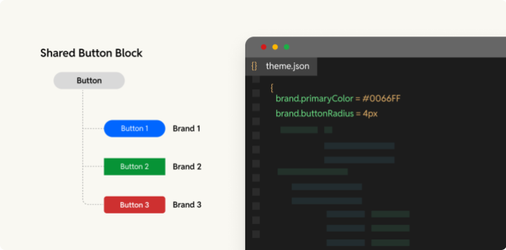
Each site has its own theme.json file which:
- Inherits shared design logic
- Overrides token values as needed
- Ensures layout consistency without code duplication
CI/CD integration for design updates
Updates to components or layout logic are:
- Deployed from the Master to all child sites
- Automatically tested across brands
- Rolled out via feature flags if needed
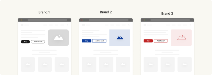
Managing divergence: aligned but not identical
Not every brand should look the same (and OnePress doesn’t force that). Divergence is part of the model, but managed.
From a brand perspective:
- Each brand keeps its unique identity through its own token set.
- Structural patterns (e.g. article layouts) remain shared (just reskinned for each brand site).
- Even when a brand requires unique templates, they can often extend existing ones instead of starting from scratch.
It’s “design once, deploy everywhere,” with room for local expression.
Conclusion
With OnePress’s Master Site model, reusable components and templates, and token-driven theming, you get the best of both worlds: creative flexibility and operational efficiency. These systems aren’t just nice to have; they translate to real, measurable savings in time, effort, and cost over time. Design teams build smarter, marketers move faster, and every brand site stays aligned.

