


Designing layouts in WordPress Block Editor
Designing layouts for Gutenberg-based themes can be make-or-break. It is important to know the built-in layout blocks to aid your design thinking.
Built-in Layout Blocks
It is good to know the layout blocks which ship with the block editor. These blocks can be used to create a variety of layouts. Following are the default layout blocks which can be used in your design:
Group
The Group block is used to combine multiple blocks inside one container so that you can set container-level properties such as background color, padding, and margins. It also supports block spacing, and can be used to organize different sections.
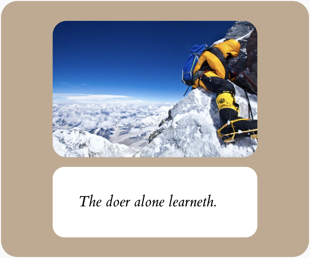
Figure 2.10 shows a group block which groups together an image and a quote. You may observe that there is a padding within the section and a background color.
Stack
The stack block can be used to align its children (inner blocks) vertically.
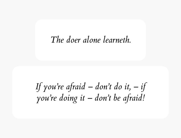
Figure 2.11 shows a stack with two Quote blocks.
Row
The row block is a variation of the stack block with its children aligned horizontally.
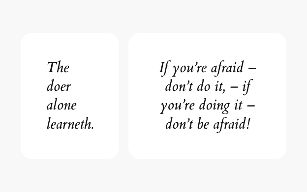
Figure 2.12 shows a row with two Quote blocks.
Grid
Grid block offers fixed width columns and multiple rows arranged in a traditional grid layout with usual functionality such as column and row spanning.

Figure 2.13 shows an auto-arranged grid block without any column spanning.
Columns
The columns block can be used to display content in multiple columns. There are multiple default layout options available such as 50/50, 33/33/33, 25/50/25, etc. It is possible to set the column widths manually.
Figure 2.14 shows columns block with 33/66 layout.
Content Adaptability
Creating layouts that adapt gracefully to different content types is crucial for WordPress block themes. Let’s explore how to achieve this effectively.
Design Flexible Grids
When designing grids, consider both minimum and maximum content scenarios. Figure 2.15 shows how a three-column grid adapts when:
- One column has minimal content
- Another has extensive content
- The third has average-length content
The key is to establish rules for:
- Minimum column heights
- Content overflow handling
- Equal height columns vs variable height
- Grid gap consistency
For example, a services grid might need equal heights to maintain visual harmony, while a blog post grid could allow variable heights for content flexibility.
Using Blocks for Complex Arrangements
The combination of Group and other layout blocks offers sophisticated layout control in WordPress. Each layout block serves distinct purposes and can be nested strategically to achieve complex designs.
Group Block Combinations
- Nest Groups for layered backgrounds and overlays
- Create card-like components with consistent padding
- Build hero sections with overlapping elements
- Establish content width constraints within full-width sections
Stack Block Applications
- Organize related content vertically with consistent spacing
- Create feature lists with aligned elements
- Build form layouts with uniform spacing
- Structure article content with predictable vertical rhythm
Row Block Usage
- Arrange elements horizontally with flexible spacing
- Create inline navigation elements
- Build pricing comparison tables
- Design feature highlights with icons
Grid Block Implementation
- Display product galleries or portfolios
- Create masonry-style layouts
- Design team member showcases
- Structure dashboard-like interfaces
Cover Block Integration
- Layer text over background media
- Create parallax-style sections
- Build full-screen hero areas
- Design promotional banners
Advanced Combinations
- Stack + Group: Create sectioned content with consistent spacing
- Grid + Cover: Build media-rich galleries with overlaid captions
- Row + Stack: Design hybrid navigation patterns
- Multiple Groups: Create depth through layered backgrounds
Considerations when combining blocks
When combining blocks, consider:
- Block nesting depth limitations
- Performance impact of complex arrangements
- Maintainability for content editors
- Responsive behavior of nested structures
The key to successful complex arrangements is understanding each block’s strengths and combining them purposefully rather than arbitrarily nesting blocks.
Vertical Rhythm System
Establishing consistent vertical rhythm requires:
- A base spacing unit (commonly 8px or 16px)
- Spacing scale multiples (1x, 2x, 3x, etc.)
- Standard spacer blocks at common heights
- Consistent use of margins and padding
For example:
- Small spacing (1x): Between related elements
- Medium spacing (2x): Between different elements
- Large spacing (4x): Between major sections
