


Designing layouts for WordPress Site Editor
Layout is a fundamental element of design that significantly impacts how information is perceived, understood, and interacted with.
In this section, we explore widely used layouts, some common scenarios and how to handle them, and more.
Designing for Dynamic Content Length
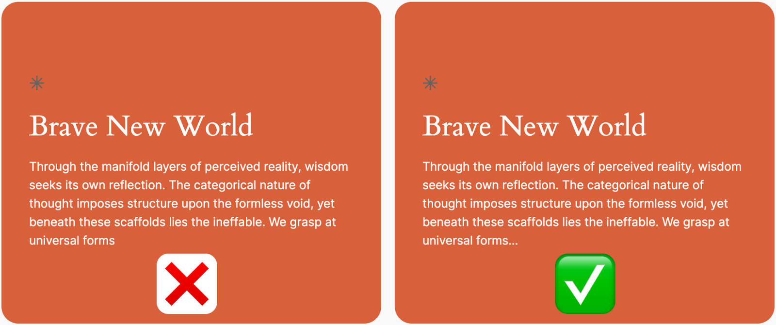
Often, I have seen that designers do not account for elements with text-heavy content. Such designs usually break when it hits an edge-case, like more text than desired is added. Therefore, it is important to design cards that gracefully expand with content.
Figure 3.4 shows two blocks. The block on the left fails to adapt to text heavy content. It does not offer any cues to the user that the content is incomplete. On the other hand (or side), the text on the right has a very minor and seemingly insignificant addition: ellipsis. It indicates that the text is incomplete.
Container Overflow Strategies
Container overflow strategies are essential techniques for managing content that exceeds its allocated space in web design. By implementing effective overflow strategies, designers can maintain visual harmony while ensuring content remains accessible and functional for users across different devices and screen sizes.
Text Overflow
Some common scenarios:
- Long headlines: Truncate after 2 lines
- Navigation items: Single line with ellipsis
- Card titles: Max 2 lines, then ellipsis
- Meta information: Single line truncation
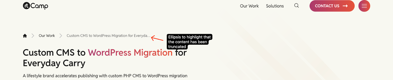
Figure 3.5 shows a breadcrumb with single line ellipsis to indicate that the text has been truncated.
Image Overflow
Handling Approaches:
- Product images: Object-fit cover
- Hero backgrounds: Scale and crop from center
- Author avatars: Circle crop with fixed dimensions
- Gallery items: Maintain aspect ratio with cropping
Content Boundaries
Clear Visual Indicators:
- Fade-out effects for truncated text
- Scroll indicators for overflow content
- “Read more” prompts for expanded views
- Shadow effects for scrollable containers
Figure 3.6 shows a sidebar with shadow to indicate scrollability.
Multi-Column Content
Examples of flexible column layouts:
- 2-column text sections
- Equal width (50/50)
- Content priority (60/40)
- Sidebar style (70/30)
- 3-column features
- Equal columns for features
- Center-weighted for highlights
- 4-column grids
- Product listings
- Team galleries
- Portfolio items
Common Pitfalls & Best Practices
Common Pitfalls:
- Deeply nested columns (3+ levels)
- Mixed-width columns in responsive layouts
- Complex overlapping elements
- Rigid height constraints on dynamic content
Best Practices:
- Keep nesting to maximum 2-3 levels
- Use consistent spacing system
- Plan for content expansion
- Consider mobile-first approach
It is important to remember that every layout decision should balance:
- Visual design goals
- Content flexibility
- Development feasibility
- Editor usability
