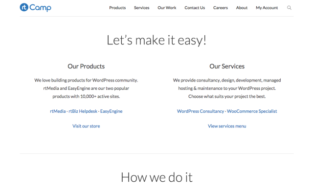
We have redesigned rtCamp again. This is the 6th major iteration to rtCamp’s design in 6 years!
This time, the focus was on going super-minimal. May be that is the reason, this re-design was done very quickly. Some frequent visitors to rtCamp felt that stylesheet isn’t loading!
Lessons Learned
Below are somethings we have learned since the last redesign:
- Avoid page builder tools as much as possible. We have used visual composer and it turned out to be a nightmare. Be it performance or complexity, we are much better without any page builder tool now. Obviously, for end-users, these tools still might make sense. In that case, you may like to check Chris Lema’s post comparing page builders.
- Don’t over-design it. Last design, which many liked, turned out to be hard on the eyes. It had too many colors. Some designers can pull multi-color designs nicely but we were not happy with what we had achieved.
- As rtCamp has many products and services, we choose to use multiple menus in the previous design. On some pages, it looked very ugly. The Header had almost 30+ links across 2 menus and breadcrumbs! In this design we have given focus to “sections”. Now when a user is in the rtMedia section, they will see only rtMedia related stuff. Same with EasyEngine and other key areas of this site.
New things tried
With every redesign, we experiment a lot!
- No link to home or logo! To give key sections importance, we did not add link to homepage or rtCamp logo in main menu. We are not sure if this is a good idea. But we decided to experiment first-hand and see results ourself.
- You may see some landing pages on this site e.g. Homepage, rtMedia, EasyEngine. These are built without using any page builder, but at the same time without writing much HTML! Forget page builder, we did not even use any shortcodes for the layout. Sagar pulled off all this with some properties of WordPress post-editor and our day-to-day copy-paste feature.
- We have tried a new font-icon library – themify-icons. It gels very nicely with our super-minimal design approach.
- We launched it very quickly. Two days ago we did not know, our new design would be live! So rather than trying to finish a design, we decided to make this design live as soon as it was ready enough. There could be bugs. There are things that we need to still work on, but we still choose to go live. Idea was not to finish a design process at any point but continuously iterate over time.
- We have tried Automattic’s Underscore_S theme. The experience has been very good. Last time we tried roots framework but it seemed unnecessarily complicated and did too many things. Underscore gave us the right amount of base needed.
Feedback Please
We hope new design will make site much faster and the content easy-to-read.
If you have any feedback, suggestions, criticism or find any issues with this new design, please let us know.
On this page


Leave a Reply