Logo Guidelines – rtCamp
Are you writing a story about us? Or making an application to us? You are welcome to use these official logos and images as part of our press kit.
Note that by using these resources, you accept our Terms and Conditions and our Privacy Policy.
Our Logo
We love our logo and it is a big part of our identity. We appreciate a lot that you follow these guidelines to ensure it’s always presented in the best way possible.

Icon
Ideally, we like the icon being used only when the brand identity is already established.
The icon can exist without the wordmark, the wordmark should never exist without the icon.

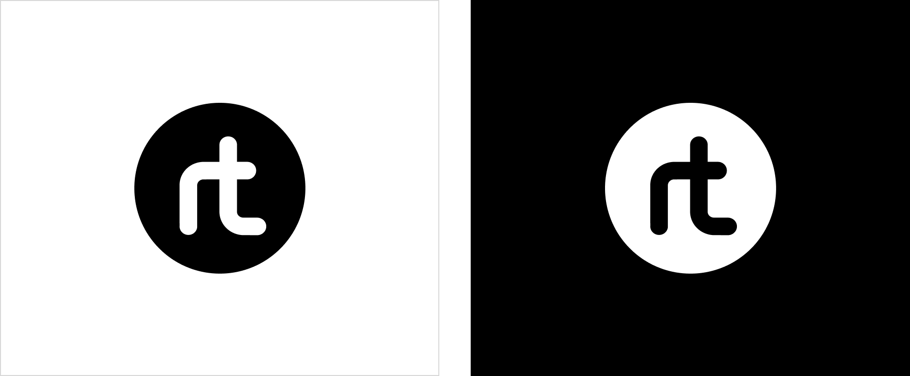
- The black logo should be used on light coloured backgrounds.
- The white logo should be used on dark coloured backgrounds.
Clear space / Exclusion zones
The logo and the icon’s exclusion zone is equal to half the height of the icon (marked as × in the diagram).

Minimum size
Establishing a minimum size ensures that the impact and legibility of the logo are not compromised.

The rtCamp primary logo width should never be smaller than 100px in digital or 20mm in print.

The rtCamp icon should never be smaller than 20px in digital or 6mm in print maintaining perfect square.
Logo misuse and alteration
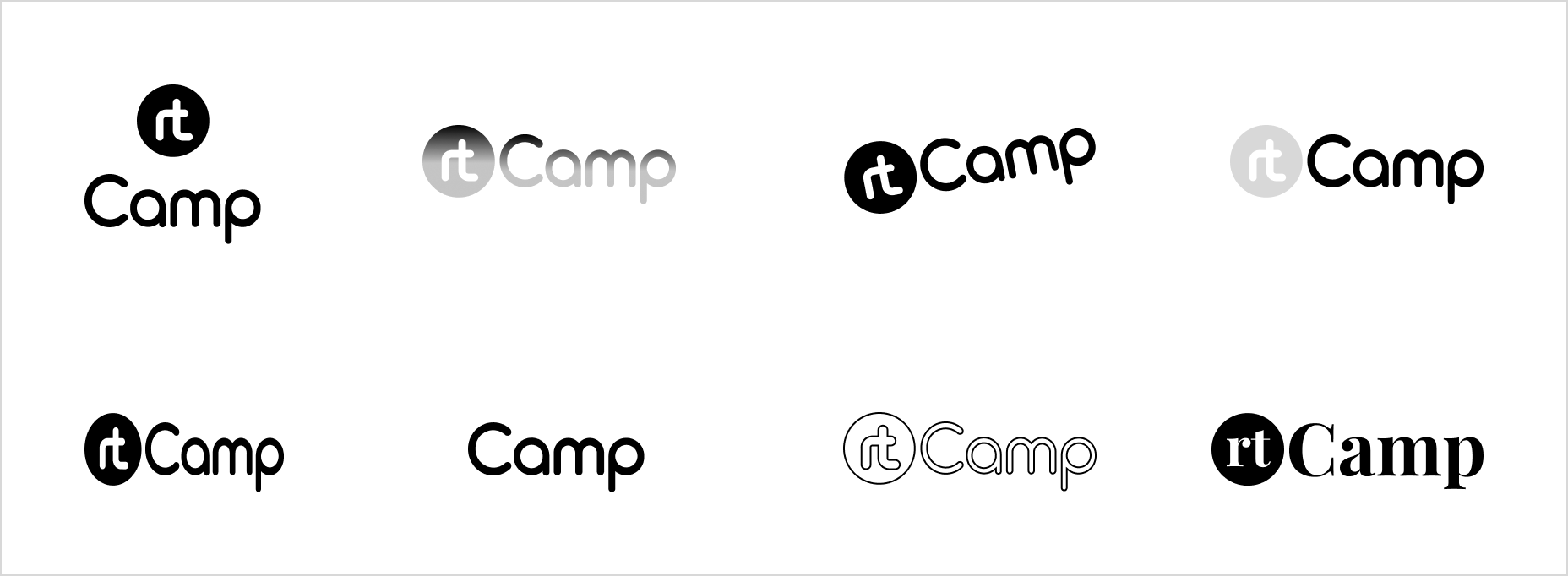
Please do not attempt to alter the logo in any way. Its orientation, colour and composition should remain as indicated in this document.
Below are some of bad examples.

Our colours
rtCamp has decided on colour black for the logo. Changing that color is considered to be an alteration of the logo.

Thank You!
If you are having trouble with anything in this guide, you are missing brand elements from the brand package, or you are unsure if your communication best represents the rtCamp brand, please contact the rtCamp design team at design@rtcamp.com.
For additional programming resources, check links below