Gutenberg is WordPress’ brand new editor. It introduces a block-based editing and development paradigm that will be the foundation of WordPress over the coming years.
Being such a huge shift in the way people build with WordPress, Gutenberg will be introduced in three phases. WordPress 5.0 will include the first phase, the Gutenberg WYSIWYG content editor.
We are genuinely excited about the possibilities that Gutenberg enables and their implications for everyone in the WordPress ecosystem. And what better way for us to understand Gutenberg than to use it on our own site?
This post highlights our journey to Gutenberg on rtCamp.com, covering the blocks we created and lessons we learned.
How we relaunched rtCamp.com with Gutenberg
Over the past few months, several rtCampers have been exploring Gutenberg from both the developer and user perspectives.
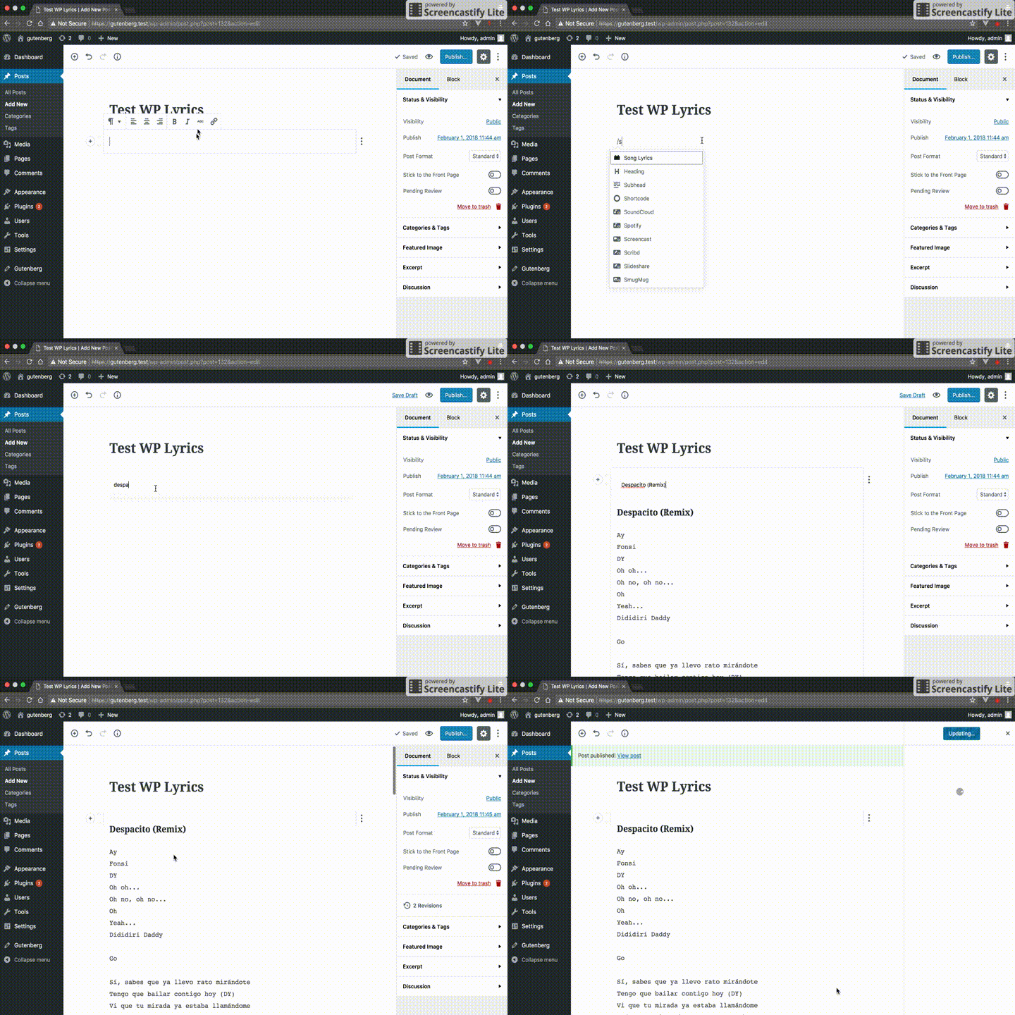
After creating a couple of blocks using the Gutenberg Blocks API, we realized that we were writing a lot of similar code to create similar UIs. We thus adopted Daniel’s idea and began work on a Gutenberg Fields Middleware plugin (that we formally announced three weeks ago.)
Our idea was to recreate rtCamp’s existing design using only the default Gutenberg blocks where possible. However, there were a couple of cases where we created custom blocks in order to get the functionality we were looking for. Both blocks used the Gutenberg Fields Middleware.
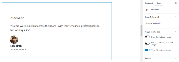
Testimonial Block
Our simple Testimonial block has the options to upload an image, add content and change the background/text colors. We are looking into iteratively adding more functionality, like multiple slides.
Showcase block
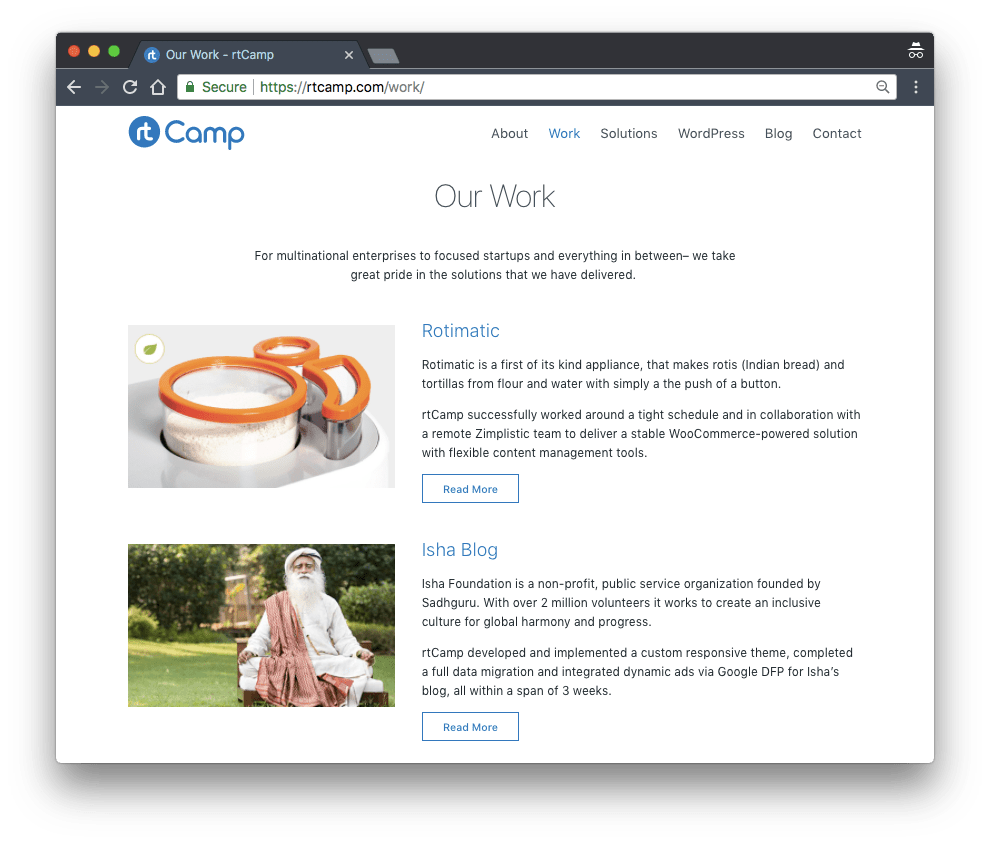
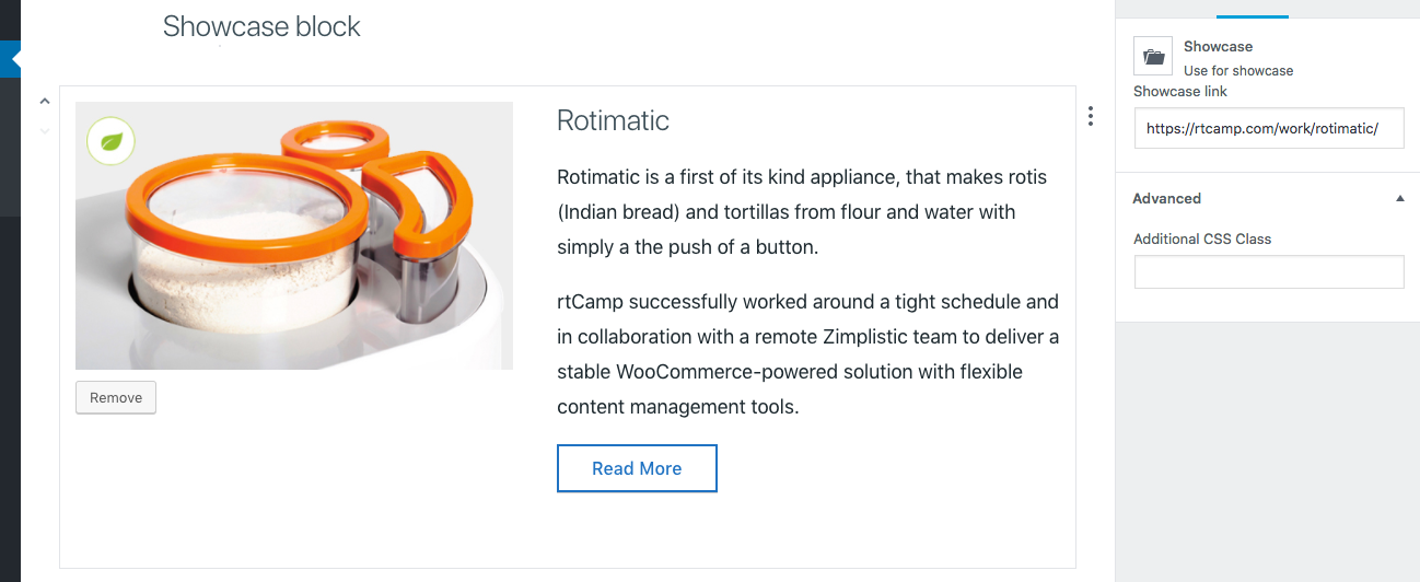
We created a showcase block to replicate the design of our portfolio page. It is a relatively simple block that provides an image panel, header & description text areas and a “Read More” button.
Some Challenges
Until WordPress 5.0 rolls it into the Core, Gutenberg is very much in beta. We understood this before getting into the project, and were prepared to work around any problems that came up.
Being a content-specific WYSIWYG visual editor, most of our issues were centered around content presentation and usability.
Making our theme compatible
Since we wanted to maintain the overall design of the site, we decided to make our existing theme Gutenberg compatible. The theme uses the system font stack, so we needed to account for the same in the backend.
We also needed to make some minor CSS adjustments in order for the frontend and backend to match, including content width and column gaps.
Finally, Gutenberg applies its own CSS for default elements like lists, blockquotes and headings. We needed to override these to get them to match the design of the theme.
The Columns block
To present information in a multiple columns, we used the default Columns block.
While the block supports alignwide and alignfull block controls, these are only applied in the editor, not in the front-end. We got around this by manually adding the alignwide and alignfull class using “Additional CSS Class” block setting.
The Column block uses the Grid layout in the backend. In order to match the frontend with the backend perfectly, we decided to use the Grid layout for front end too. Our current theme uses Flexbox, so there was a period of adjustment as we figured out how to get over the limitations of Grid layout.
Editing content
The Gutenberg editor currently uses very subtle visual indicators to show separation between elements. This can get especially confusing for areas of pages that have a lot of elements, like this area on one of our landing pages:
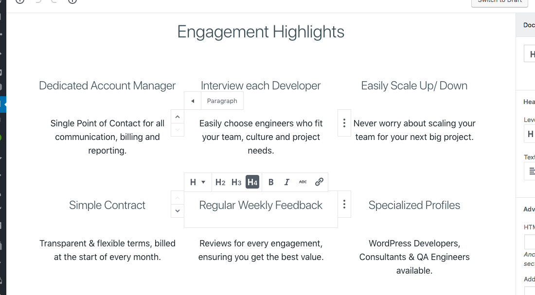
In its current form, Gutenberg’s Preview button does not work under certain circumstances. Since all pre-release work was in a development environment, we could get away with publishing all our changes every time we needed to “preview” them.
The Results
All pages and posts on rtCamp.com have been created in the Gutenberg editor. The process still has room for improvement, but on a relatively simple site like ours, Gutenberg does a great job as the sole editor.
All our blog posts going forward will be created in Gutenberg (including this one!) which, in our opinion, is much more intuitive to use than the older TinyMCE editor.
What are your experiences working with Gutenberg? Spotted anything you like on our website? We would love to know!
Links: Fields Middleware | Gutenberg Suppliments
On this page


Leave a Reply