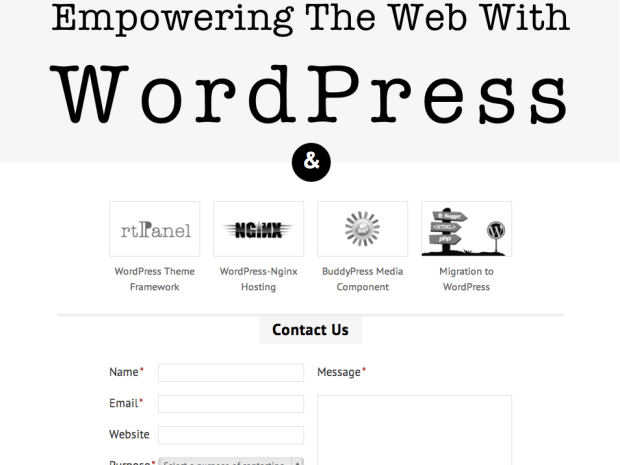
If you have visited rtCamp.com in last 3-4 days, you might have noticed a completely redesigned site. Our nicely decorated home with moving clouds is replaced with a simpler & minimalistic homepage.
It was very tough to break away with that insanely creative home, which fascinated hundreds of visitors everyday. But as Heraclitus said, “Nothing is permanent except change”, we decided to change our homepage even though it was working nice!
Before we tell you the reason behind this major re-design, it will be good to know some history about our old design.
The rationale behind old homepage/design
It was 2010, when old design was created, it was the time when WordPress was considered merely as a blogging platform, and it was the time when we were handful of young minds struggling to prove our worthiness. Last design was created to convey different set of ideas. I will try to list down some of those…
- rtCamp was relatively new kid on the block. We wanted to break the norm. So rather than going for typical corporate or CMS designs we decided to take non-traditional path…
- That unconventional design, including moving clouds, which was considered to be developed using flash; in-fact was developed in HTML, CSS & jQuery alone. HTML5 was not used as browser support for HTML5 was poor then.
- WordPress was mainly used for blogging. In typical CMS world, jQuery-slideshow/tabs used to be only non-static part. We wanted to create something using WordPress which will create an impact in first eyesight and which will make it hard to believe that we were using WordPress behind the scene!
Story behind new rtCamp.com
As we grew from a dozenful guys to almost team of 50, from 1 office to 2 offices, from few services to many services and added to it (coming-soon) premium products, we needed a home which can accommodate growing rtCamp.
Last design was too much about rtCamp itself. Which was fine since we had many micro-sites to boast about our work. But as our service offerings and products (mostly WordPress plugins) kept growing, it started becoming tough to launch independent microsite for each major service/product and then keep it updated, coupled with social-media/branding overhead.
Eureka moment
One day, we realized that time/energy we were spending on maintaining so many microsites can be utilized to make our products better! It was our eureka moment.
It prompted us to merge rtPanel.com, WpNginx.com, MediaBp.com and rtBlogs.com back into main rtCamp.com site. It took almost 2-3 weeks and slight redesign for inner pages while merger. But once we did it, we realized, all of a sudden we have so much time to develop/upgrade our WordPress plugins. We also managed to develop updated version for our Buddypress Media plugin which was in broken state for almost 2 years.
But…
But there was still a problem! Even though merging most of our sites simplified our day-to-day life, our homepage gave us no space to talk about our work (which matters a lot to us!).
There was an idea to use a banner in sky (instead of cloud) to show our featured work. There were few more ideas like that. But a simple patchwork did not feel right thing to do. So we decided to come up with a new & fresh design!
Minimalism…
When we decided to go with a fresh design, the obvious choice was minimalism!
Minimalism is not because its a trend now. Its because we are doing so many things and if we decide to put everything on homepage, it will take hours (and coffee) for our visitor to read entire homepage. We know that nobody in today’s world has a lot of free time to do that.
When you realize you cannot tell everything, take the opposite approach. Tell only things that are important. If you cannot decide where to cut-off, go for most important 5-things.
And ‘minimalism’ was outcome of this approach.
Technologies
It may look like that this time we used WordPress as most people use it. Well its entirely true. We pulled off a site which is full of different type of landing pages without creating a single page-template. (You can say “wow” if you are a WordPress geek, others can ignore our bragging!)
We relied heavily on 960 grid system, HTML5, CSS3 and jQuery (again). Apart from that we have used Google Fonts. We are also taking efforts to make this website responsive for iOS/Android browsers.
Lastly, as ususal, we did not bother about how our sites looks in IE browsers!
The best is yet to be…
Everytime we achieve something, I remember lines by Robert Browning which says,
Grow old along with me!
The best is yet to be…
Yes, the best is yet to be… This new site is not our destination. Its our platform to share our amazing works with you. Stay in touch!
On this page


Leave a Reply