When to Choose Core Blocks?
Core blocks are the content types in WordPress, and they are the basic, pre-built components including headings, paragraphs, buttons, and images. They are designed to support the most widely used content elements without coding or using any plugins.
Some of the principal abilities, which core blocks offer, include:
- Provides for the basic layout of text, images, galleries, and embeds
- The core blocks of the WordPress platform have been built to be fast and responsive, thus ensuring that your site remains responsive.
- You can customize a block even further by applying your custom CSS, through the block settings, or using filters.
Core blocks are suitable for almost all standard website constructions where only minor changes are needed. You can easily build pages or posts with readymade blocks, for example, paragraphs, images, galleries, and buttons.
Scenarios Where Core Blocks Suffice
There are many situations where the core blocks will be enough. Here are when you can use core blocks:
Simple Content Sites or Blogs: If your site content contains text, images, and simple formatting, you can settle for core blocks. You’ll get rich layouts for content without extra work in development.
Landing Pages: A simple landing page that will use only a few basic elements, like headers and buttons with images, can still use core blocks. Since they contain everything you need for a clean, functional design, you’ll be set.
Little Customization: If the theme and design require little customization both visually and functionally, you can use core blocks to save most of your development time. Most of the needs would easily be catered to by merely making slight style modifications and adopting the default settings for core blocks.
Best Ways to Edit Core Block Styles
Customizing the styles of core blocks in WordPress helps you maintain a consistent design without rebuilding everything from scratch. Here are the best ways to do it:
Using theme.json
The theme.json file is a powerful tool introduced in WordPress 5.8, allowing developers to configure global styles for blocks. It simplifies customization by eliminating the need for manual CSS and lets you set colors, typography, spacing, and more across your site.
Example: Setting Typography for Core Blocks
Here’s how you can set custom font sizes for blocks using theme.json:
			{

  "version": 2,

  "settings": {

    "typography": {

      "fontSizes": [

        {

          "name": "Xtra Small",

          "slug": "xtra-small",

          "size": "10px"

        },

        {

          "name": "Small",

          "slug": "Small",

          "size": "12px"

        }
        {

          "name": "Normal",

          "slug": "normal",

          "size": "14px"

        },

        {

          "name": "Medium",

          "slug": "medium",

          "size": "16px"

        }

      ]

    }

  }

}
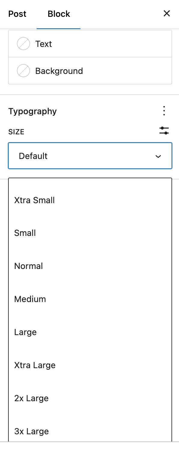
In this example, we define two font sizes—“small” and “large”—that users can select from within the Block Editor. This ensures consistency in typography without needing to write CSS for each block.
It will be shown something like this in the editor:

When to Use theme.json:
- You want to apply consistent styles globally across all blocks.
- You’re working on a theme that requires easy customization for non-developers.
- You need to set defaults like font sizes, color palettes, or spacings that can be applied across multiple blocks.
Applying Custom CSS Classes
For more granular or specific styling needs, adding custom CSS classes to individual blocks is often the best solution. WordPress lets you assign a custom class name to any block, which you can then target with your own CSS styles.
How to Add a Custom Class:
- Select any block in the Block Editor.
- In the block settings on the right panel, scroll down to the “Advanced” section.
- Add your custom class name in the “Additional CSS Class” field.
Example: Styling a Button Block
Let’s say you’ve added the class name custom-button to a Button block. You can now write CSS targeting this specific button:
			.custom-button .wp-block-button__link {

  background-color: #0073aa;

  color: white;

  border-radius: 10px;

  padding: 10px 20px;

}
This CSS changes the button’s background color, and text color, and adds rounded corners and padding.
When to Use Custom CSS Classes:
- You need block-specific customizations that wouldn’t apply to all blocks of the same type.
- You want to override styles for just one instance of a block (e.g., a special call-to-action button).
- You’re working on projects where design flexibility is needed and you want to experiment with different styles for different pages or sections.
Best Ways to Edit Core Block Logic
When you’re working with core blocks, sometimes you need to tweak the way they behave, either changing the way they are rendered on the front end or adding extra functionality. WordPress offers several ways to modify core block behavior, including using block filters, custom settings, and extending blocks via JavaScript.
Utilizing Block Filters
WordPress allows you to change how blocks are rendered through block filters. Filters are a powerful way to hook into core block logic and modify it without touching the core files. They are particularly useful for adding wrappers, injecting extra HTML, or modifying block attributes.
Here’s a detailed look at some common block filters you can use:
render_block Filter
This is one of the most versatile filters, allowing you to modify the output of any block before it’s rendered on the front end. You can target specific block types (e.g., paragraph, button) or apply a change to all blocks.
Example: Adding a Wrapper Div to a Block
Let’s say you want to wrap every Paragraph block with a <div> for extra styling:
			add_filter('render_block', 'add_custom_wrapper', 10, 2);

function add_custom_wrapper($block_content, $block) {

    if ($block['blockName'] === 'core/paragraph') {

        return '<div class="custom-wrapper">' . $block_content . '</div>';

    }

    return $block_content;

}
This filter checks if the block being rendered is a Paragraph block (core/paragraph). If so, it wraps it with a custom <div>. This allows you to style or modify the block’s behavior without touching the block’s original structure.
register_block_type_args Filter
If you need to modify how a block is registered or add new attributes to a block, you can use the register_block_type_args filter. This helps add custom controls or new functionality.
Example: Adding Custom Attribute to Button Block
You might want to allow users to add an icon to the button block. Using register_block_type_args, you can add a new attribute:
			add_filter('register_block_type_args', 'add_icon_to_button_block', 10, 2);

function add_icon_to_button_block($args, $block_name) {

    if ($block_name === 'core/button') {

        $args['attributes']['iconClass'] = [

            'type' => 'string',

            'default' => 'default-icon'

        ];

    }

    return $args;

}
This code snippet adds an iconClass attribute to the button block, allowing users to specify an icon class that will be added to the button.
Practical Scenarios for Using Filters
Here are some real-world scenarios where using block filters makes sense:
- Custom Post Layouts: Add wrappers to core blocks (like paragraphs or images) for custom post designs without modifying theme templates.
- Content Injection: Automatically inject custom HTML, like social media icons or disclaimers, within specific blocks.
- Dynamic Block Customization: Modify the rendering of blocks dynamically based on user input or other variables (e.g., displaying different button styles for logged-in users).
Extending Core Blocks
Sometimes, simply modifying the output of a block isn’t enough. You may want to extend a block’s functionality to allow more control in the Block Editor itself. For this, you’ll need to extend the block by adding custom attributes and controls.
Example: Extending the Button Block with a Custom Icon Option
Let’s walk through an example where we extend the Button block to include an option for users to add an icon next to the button text. We’ll use JavaScript to modify the block settings, add new controls, and render the block with the new functionality.
Register Custom Block Script
First, we need to enqueue your custom JavaScript to modify the button block
			function enqueue_custom_block_js() {

    wp_enqueue_script(

        'custom-block-js',

        get_template_directory_uri() . '/custom-block.js',

        array('wp-blocks', 'wp-element', 'wp-editor'),

        null,

        true

    );

}

add_action('enqueue_block_editor_assets', 'enqueue_custom_block_js');
Modify the Block’s Edit Function
In our custom-block.js file, we’ll extend the Button block to include an icon class option:
			const { registerBlockType } = wp.blocks;

const { InspectorControls } = wp.blockEditor;

const { PanelBody, TextControl } = wp.components;

wp.hooks.addFilter('blocks.registerBlockType', 'custom/button-icon', (settings, name) => {

    if (name === 'core/button') {

        settings.attributes.iconClass = {

            type: 'string',

            default: ''

        };

    }

    return settings;

});

wp.hooks.addFilter('editor.BlockEdit', 'custom/button-icon-edit', (BlockEdit) => (props) => {

    if (props.name === 'core/button') {

        return (

            <>

                <InspectorControls>

                    <PanelBody title="Icon Settings">

                        <TextControl

                            label="Icon Class"

                            value={props.attributes.iconClass}

                            onChange={(value) => props.setAttributes({ iconClass: value })}

                        />

                    </PanelBody>

                </InspectorControls>

                <BlockEdit {...props} />

            </>

        );

    }

    return ;

});
This script adds a text input in the block inspector sidebar, where the user can input an icon class.
Rendering the Block with the Icon
Finally, you modify the block’s front-end rendering to include the icon:
			add_filter('render_block_core/button', 'add_icon_to_button', 10, 2);

function add_icon_to_button($block_content, $block) {

    if (!empty($block['attrs']['iconClass'])) {

        $icon = '<i class="' . esc_attr($block['attrs']['iconClass']) . '"></i>';

        return $icon . $block_content;

    }

    return $block_content;

}
This filter adds the specified icon before the button content, allowing users to add icons without having to code them manually.
When to Extend Core Blocks?
Extending core blocks is a good approach when:
- Custom controls are needed: When the basic settings provided by core blocks don’t meet your client’s needs.
- Reusable features: When you find yourself repeating the same customizations across multiple projects, it’s better to extend the core blocks for consistency and ease.


